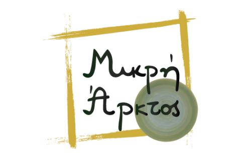
Mikri arktos logo
What we did
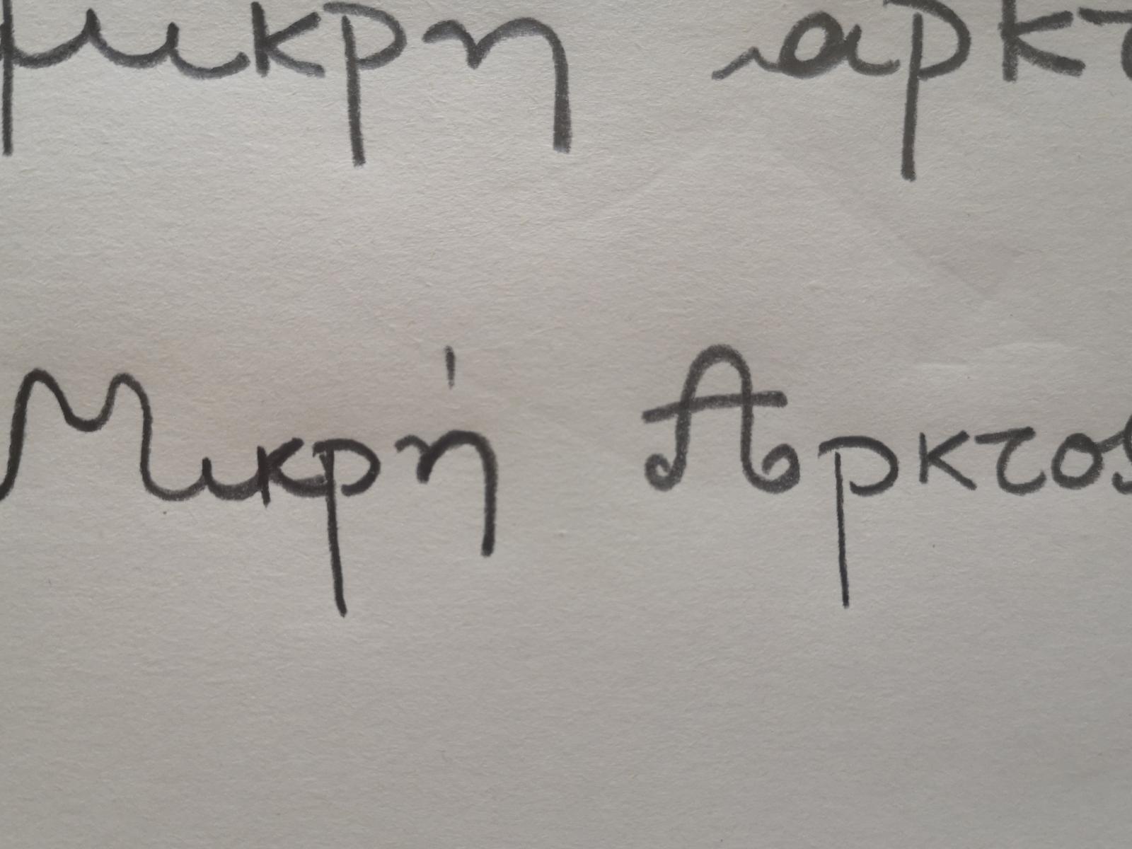
- Started with hand-drawn sketches, exploring shapes and concepts that reflect warmth, care, and childhood.
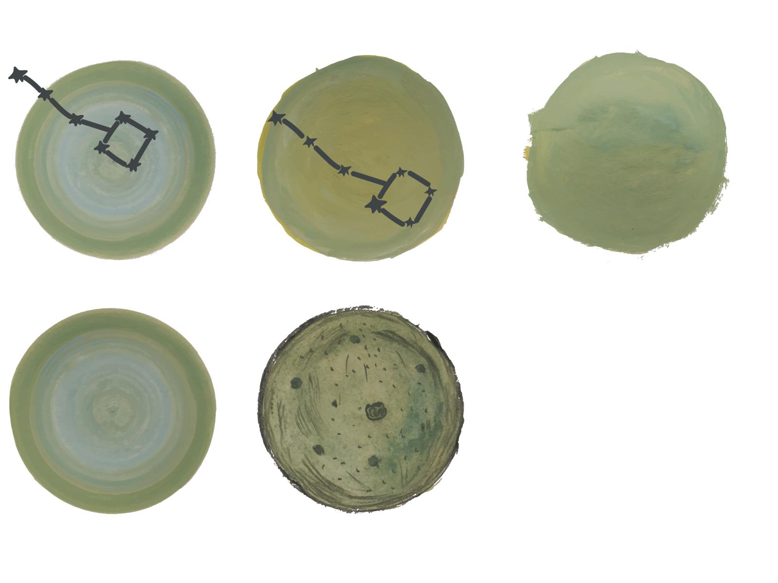
- Chose the most fitting idea and painted it by hand to capture authenticity and playfulness.
- Transferred the artwork into Adobe Illustrator for refinement, scalability, and professional application.
- Created a logo that balances artistic personality with practical usability across print and digital media.
Image

Website
The Context
Mikri Arktos is a nursery school that represents a safe, nurturing, and creative environment for children. The logo needed to communicate warmth, friendliness, and trust, while also being modern and versatile enough to be used on signage, stationery, uniforms, and online platforms.
The Challenge
- Dual Identity: The logo had to speak both to parents (trust, professionalism, safety) and to children (playfulness, creativity, warmth).
- Balance: Maintaining the emotional value of the hand-drawn artwork while ensuring professional clarity and adaptability in different sizes and formats.
- Versatility: Designing a logo that works equally well in color and monochrome, on both small (social media icons) and large (building signage) applications.
The Solution
We combined the emotional authenticity of hand-painting with the technical precision of digital design. By first painting the logo, we preserved a human touch and a sense of warmth that resonates with children and families. Then, by digitizing it in Illustrator, we ensured clean lines, scalability, and a professional look.
The result is a logo that captures the essence of Mikri Arktos — a nurturing, creative space where children feel safe and inspired — while also providing the school with a strong, flexible visual identity for all communication needs.

