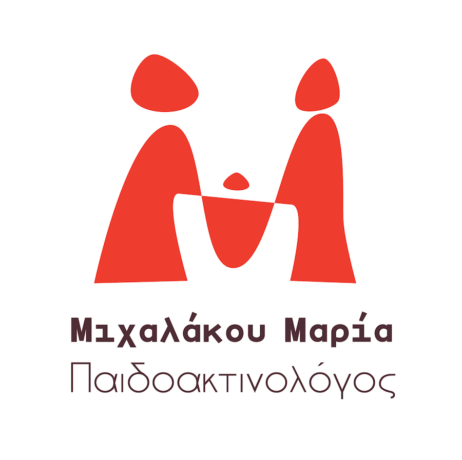
Dr. Maria Michalakou logo
What we did
- Brand's name: research & finding.
- Logo system design.
Website
The Context
Dr. Maria Michalakou is a radiologist specialised in children radiology. She has recently opened a modern and independent practice, fully-equipped in high-end medical equipment. She has commissioned us to conceive an original identity system which would both represent and appeal her target audiences: parents and general practitioners who refer patients to her. Of course, adults weren't to be kept out.

Challenges & Objectives
Creating something appealing to all targeted audiences: parents -looking for a radiologist for their children patients-, children themselves, and adult patients. Using a chromatic palette in the reds, so as to remain in the medical field's nuances, adding some "unusual" tones to what is generally used/dared in that field of industry.
The Solution
The logo which we've created gathers multiple meanings and "symbolics". The first being the one of the family: the father, child and mother holding hands. The child stands right in the middle. Children are indeed the Doctor's first priority. But, if you look closer, you will be able to distinguish -in the negative space of the logo- a part of the Greek letter "μ" -as an hommage to the logo's owner, Dr. Maria Michalakou - indeed, both her names begin with an "m". Also, you can find in the logo's curves, a reminder of the radios' curves.
Last, but not least, the entire logo is influenced by the Cycladic figurines and effigies.
We've created a logo which is extremely versatile and effective across all communication channels — print and online — allowing Ms. Michalakou to have a stronger visual presence.
