The Vaio logo
Although we usually don't like to advertise, here comes the time where we'd like to refer to someone else's work, especially to Sony's VAIO logo!
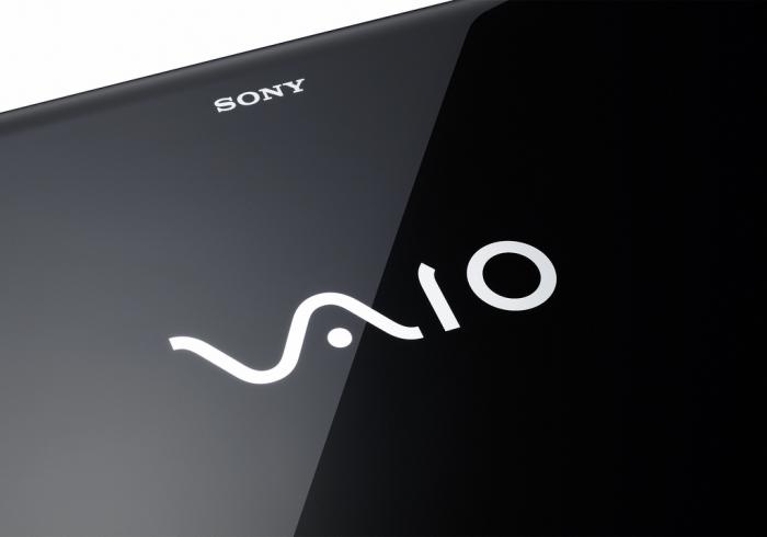
Vaio is a great example of having a hidden meaning within your logo! In fact, it is so hidden, that we only picked up on it recently! The logo integrates the ideas of analog and digital technology into one, using the V and A to represent an analog wave, and the I and O to represent binary from the digital world!
Wikipedia's definition of Sony's VAIO logo goes like this:
"Originally an acronym of Video Audio Integrated Operation, this was amended to Visual Audio Intelligent Organizer in 2008 to celebrate the brand's 10th anniversary. [1] The logo concept was created by Teiyu Goto, supervisor of Product Design at the Sony Creative Center in Tokyo. He has incorporated many meanings into the logo as well as the acronym: the pronunciation is similar to "bio", which is symbolic of life and the product's future evolution; it's also near "Violet", which is why most early Vaios were purple or included purple components. Additionally, the logo is stylized to make the "VA" look like a sine wave and the "IO" like the binary digits 1 and 0, the combination representing the merging of analog and digital signals. [2] The sound some Vaio models make when starting up, is derived from the melody created when pressing a telephone keypad to spell the letters V-A-I-O. [3][4]
Logo Design
Professional logo design includes many stages of creation, and the majority of time is not always spent crafting the logo itself. Plenty of billable hours can be spent on due diligence, often referred to as the discovery stage. This is the opportunity to search for key information that will inform the design of the logo. This stage of research and discovery is paramount to the overall success of the logo, it is important to understand who your audience is, what makes them tick, and how they are interacting with your brand or similar brands.
Market research garnished from the discovery stage can manifest itself in a few ways in the design of the logo.
- It can be informative but not appear in the logo.
- It can be visually incorporated in a more literal sense (meaning the symbol -or wordmark- reflects the product or service closely).
- It can be subtly incorporated, often seen as an Easter egg or hidden message.
A little word about the validity of these three ways to use market research in logo design: none is superior to another as long as their reasoning was inline with their goals and research. For example, it may be sharply advantageous to have a logo that is more literal when the product or service is less familiar to the general public. Your logo then can become a part of the education process, so that consumers can identify what your business does.
However, I would contend that subtle use of informed design elements to communicate an intentional message will often show a higher level of understanding in the company and brand. Not to mean that it’s superior in its effectiveness, but more so that Easter eggs in a logo are not accidental.
The Sony Vaio Logo is Rooted in a Deep Understanding
The Technology
Both the analog wave and binary code, in this case, are vehicles that carry the information to and from your screen. Analog waves are a less reliable -and imperfect method- to transfer data. Binary has been the successor with higher fidelity and smaller packaging.
This transition is easily illustrated in televisions where analog waves were predominantly captured by your tv’s antennas to transmit the image and sound of the program you were watching. The new technology, however, uses digital binary code to transfer and receive your cable signal, allowing for higher quality imaging and advanced functionality.

The Implementation
The Sony Vaio logo is made of two parts, the “va” and “io”. Both parts were cleverly crafted to contain a deeper meaning based on the history of the company, the progression of the technology and Sony’s transition into the future. Beginning with the more antiquated technology, the analog wave, the “v” and “a” are combined to reflect the image of an analog wavelength. Moving from left to right, showcasing the progress into the future; the “i” and “o” then work together to represent binary code. The movement from left to right, from the analog wave to binary code, reinforces the progress of the technology and showcases Sony’s movement from television products and into digital computing: the intended purpose of the Vaio sub-brand.
To summarize, the Sony Vaio logo has three concealed messages; the analog wave, the binary code and logos transition from left to right highlighting the evolution of the technology and the company.
Why the Fuss?
Because this type of intelligent and informed logo design is being overlooked and the light is being shined too brightly on the wrong marks!